

Rural hospitals are paid less than urban hospitals
An unprecedented look at the urban-rural reimbursement gap using 93M+ negotiated commercial rates

TL;DR? Here’s a one-page version of this post. You can also see the code/methods on GitHub.
Rural hospitals are in trouble. Over the past decade, over 100 rural hospitals have closed, and those remaining face new and stronger headwinds. Massive cuts to Medicaid from the OBBB, more scrutiny on federal rural reimbursement programs, lower reimbursement and patient volume from Medicare Advantage, reduced 340B savings, and increased labor costs all point to an increasingly uncertain future for rural hospitals.
In light of such obstacles, policymakers and providers alike are interested in boosting the income of rural hospitals. Congress, for its part, has focused its effort on strengthening public payers and programs (e.g. Medicare, Medicaid, 340B, CAH, REH, etc.). However, that singular focus has left a huge gap in knowledge about the private, commercial side of the ledger.
How much are rural hospitals actually paid by insurers? How do those payments compare to urban hospitals? What factors drive differences in urban-rural reimbursement? Recent studies are scant and limited, leaving policymakers to try to answer these questions themselves. This study aims to fill such knowledge gaps and provide a new data point for discussing rural hospital finances.
Using an unprecedentedly large (93M+ rates) sample of price transparency data from over 5,000 U.S. hospitals, I show that rural hospitals are reimbursed significantly less than urban hospitals by commercial insurers. Further, I find that the price gaps between inpatient/outpatient care and independent/health system hospitals widen in rural areas. These trends are robust to different definitions of rurality, baskets of procedures, and weighting methods.
The size of this urban-rural reimbursement gap - and how it changes over time - has huge potential consequences. Small fluctuations in income can push rural hospitals’ operating margins into the red, possibly forcing them to merge with larger, more urban health systems, eliminate service lines such as obstetrics, or close altogether. The result is higher healthcare costs, expanding care deserts, worse health outcomes, and local economic disruption.
Rural hospitals receive less
Rural hospitals are reimbursed roughly 20 percentage points (pp) less than urban ones, relative to baseline Medicare rates. In other words, the median commercial rate at a rural hospital is 232% of Medicare, while the median commercial rate at an urban hospital is 253% of Medicare. Rural hospitals also have slightly more variation in their prices than urban hospitals, with IQRs of 77 pp and 73 pp, respectively. Here’s the difference visualized nationally:
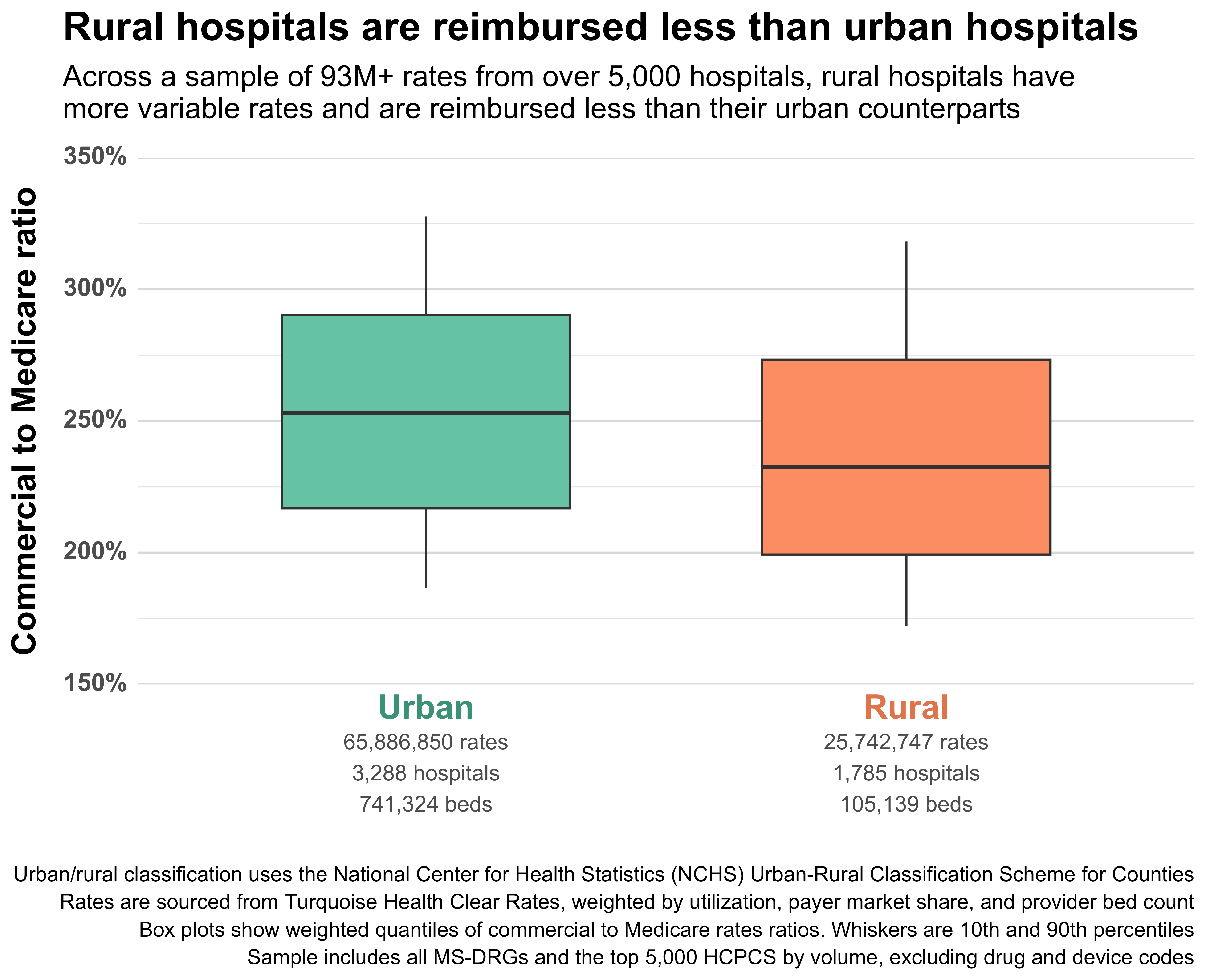
It’s worth emphasizing the massive scale of the data included in this simple plot. It includes rates from 5,073 hospitals and 51 major health insurance companies. It includes all MS-DRGs, all APR-DRGs, and the top 5,000 Medicare-payable HCPCS (excluding drug, device, and some specialty codes).
In all, it includes 93,319,856 cleaned, validated, and normalized rates spanning dozens of contracting methods and edge cases. The data here is many orders of magnitude larger and more complex than the price transparency data used in previous urban-rural studies. And it is more up-to-date (as of October 2025) than studies that rely on claims data.
The scale of the data also lets us break the high-level urban-rural aggregation into finer geographies and classifications. Where previous studies mostly used states as the geographic unit of study, this new data is dense enough to use counties or even Census tracts (previous studies achieved this but were sparse/incomplete). Here’s a county-level map of commercial reimbursement relative to Medicare across the entire United States:
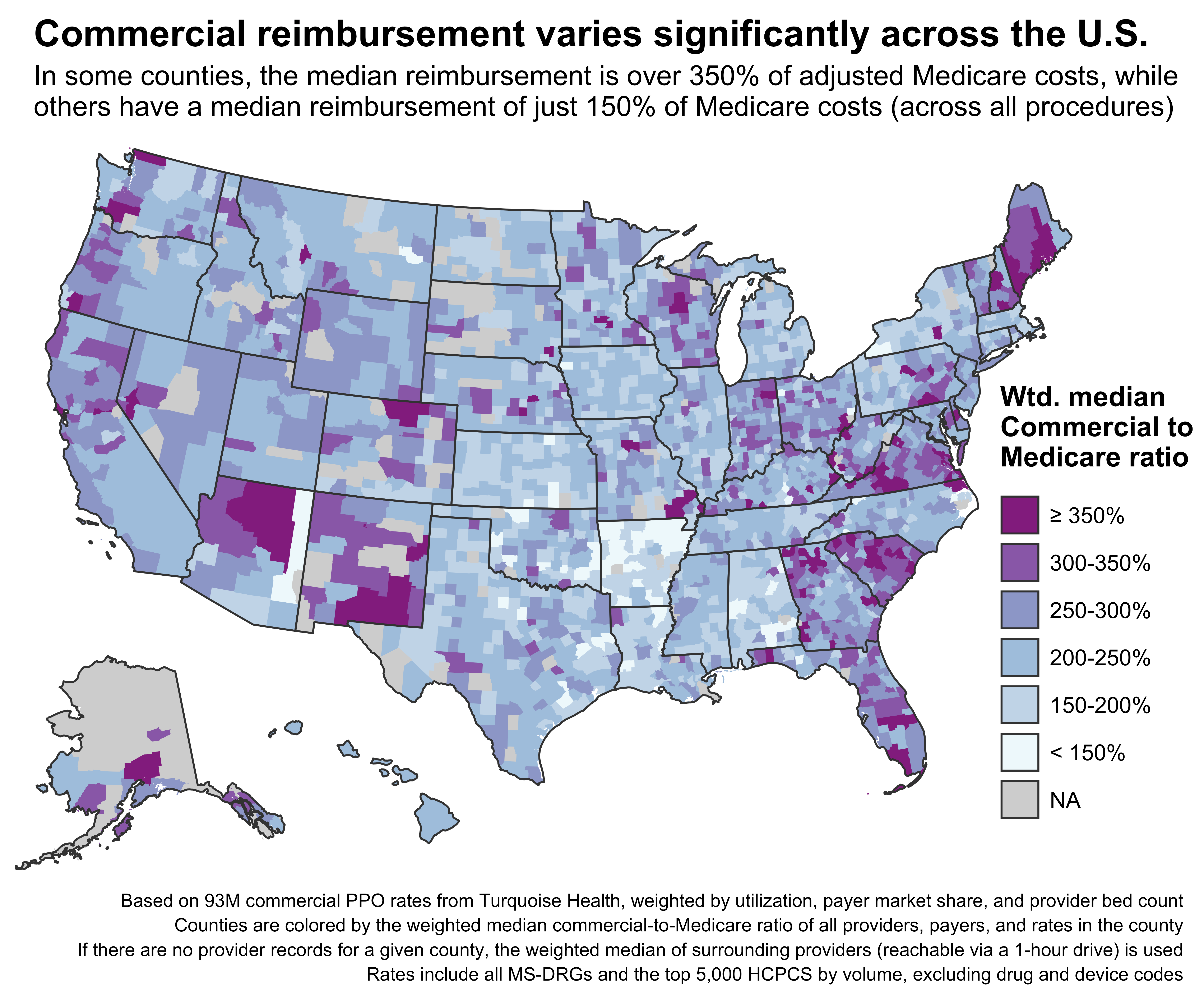
Each county shows the weighted median of rates from providers inside its borders. Some counties don’t have any providers, and in those cases, a 1-hour driving time catchment is used to aggregate providers from surrounding counties (exclusively for this map, not the rest of the analysis).
The patterns here match fairly well with previous state-level studies examining commercial-to-Medicare prices, but the county-level map lets us see details that are masked when aggregating to the state level. For example, the highest reimbursement in Georgia is concentrated around Atlanta and its surrounding counties, while the eastern part of the state has much lower reimbursement rates. Washington and Oregon likewise have their highest rates concentrated in the western, more urban parts of each state.
However, the real advantage of the finer, county-level granularity is that we can more precisely classify areas as urban or rural. This will let us expand the simple urban-rural dichotomy into a spectrum. Here’s the map again, now colored by each county’s rurality using the National Center for Health Statistics (NCHS) classification system:
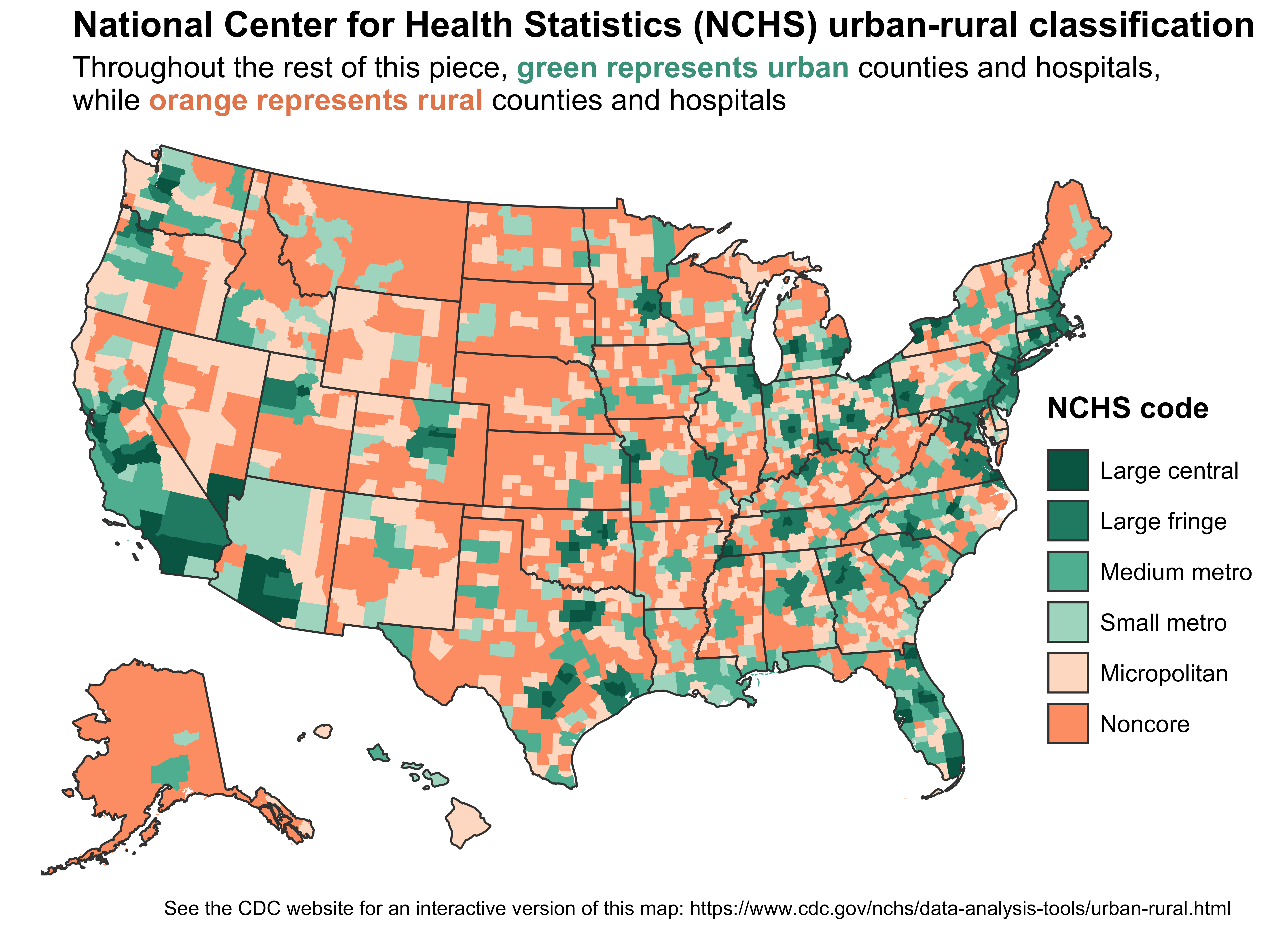
The NCHS uses a six-level scheme to classify counties by rurality. Orange counties are rural (or nonmetropolitan), while green counties are urban (metropolitan). Each color is segmented out further by population density and metro type/size.
This classification scheme isn’t perfect. It doesn’t account for within-county variation in rurality, which matters a lot for larger counties. For example, Coconino County in Arizona is classified as a “Small metro” county because it contains Flagstaff, but the vast majority of its land area is desert, reservations, and parks.
Still, combining this classification system with county-level aggregate rates lets us move beyond the simple urban-rural divide and see more interesting trends. Here’s the urban-rural boxplot from before, now broken out by the six levels from the map:
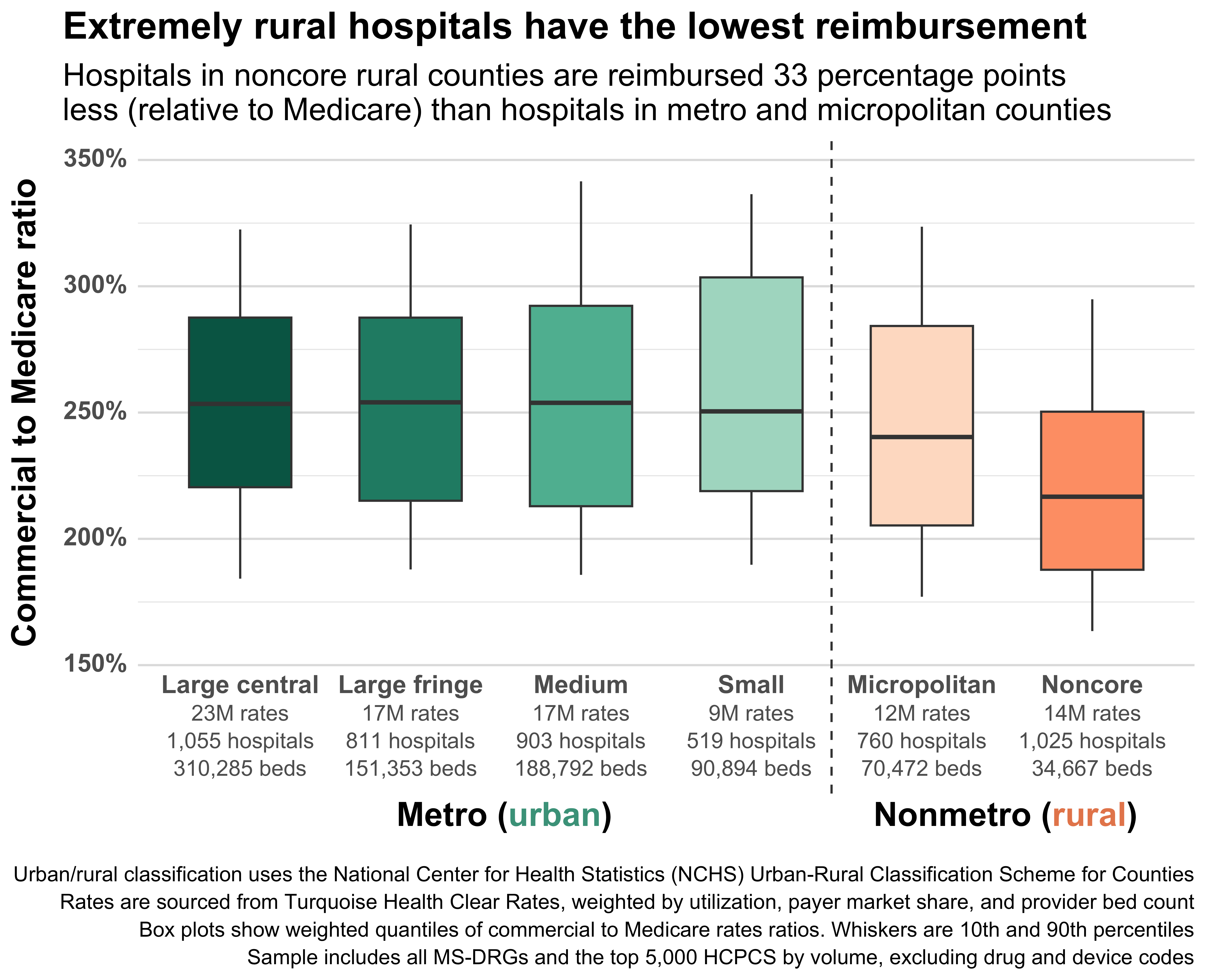
The six-level scheme reveals some previously hidden trends. First, there’s huge variation within the rural classification. Hospitals in the most rural U.S. counties (Noncore) are reimbursed roughly 33 percentage points less than urban hospitals, and 23 percentage points less than the Micropolitan counties that are also considered rural. Second, there’s not much variation within the urban classification – medians are around 250% of Medicare across the board.
The overall takeaway here is that the most rural places receive the lowest reimbursement, while prices everywhere else are fairly similar. We call this the urban-rural reimbursement gap.
Unpacking the urban-rural reimbursement gap
There are dozens, possibly hundreds, of reasons why rural hospitals might be paid less than urban hospitals. A full causal analysis or examination of all possible confounding variables is beyond the scope of this piece. However, we can at least unpack the gap further by looking at some common drivers of reimbursement variation.
The cleanest cut is by site of care. There’s a huge gap between inpatient and outpatient reimbursement in general, but the gap gets much wider for rural hospitals. Across the four urban NCHS classifications, the gap between inpatient and outpatient rate medians hovers between 55 to 65 percentage points. However, that gap jumps to roughly 95 percentage points for rural hospitals. This jump is driven largely by inpatient reimbursement rates dropping rapidly as hospitals become more rural, while outpatient rates remain (relatively) stable.
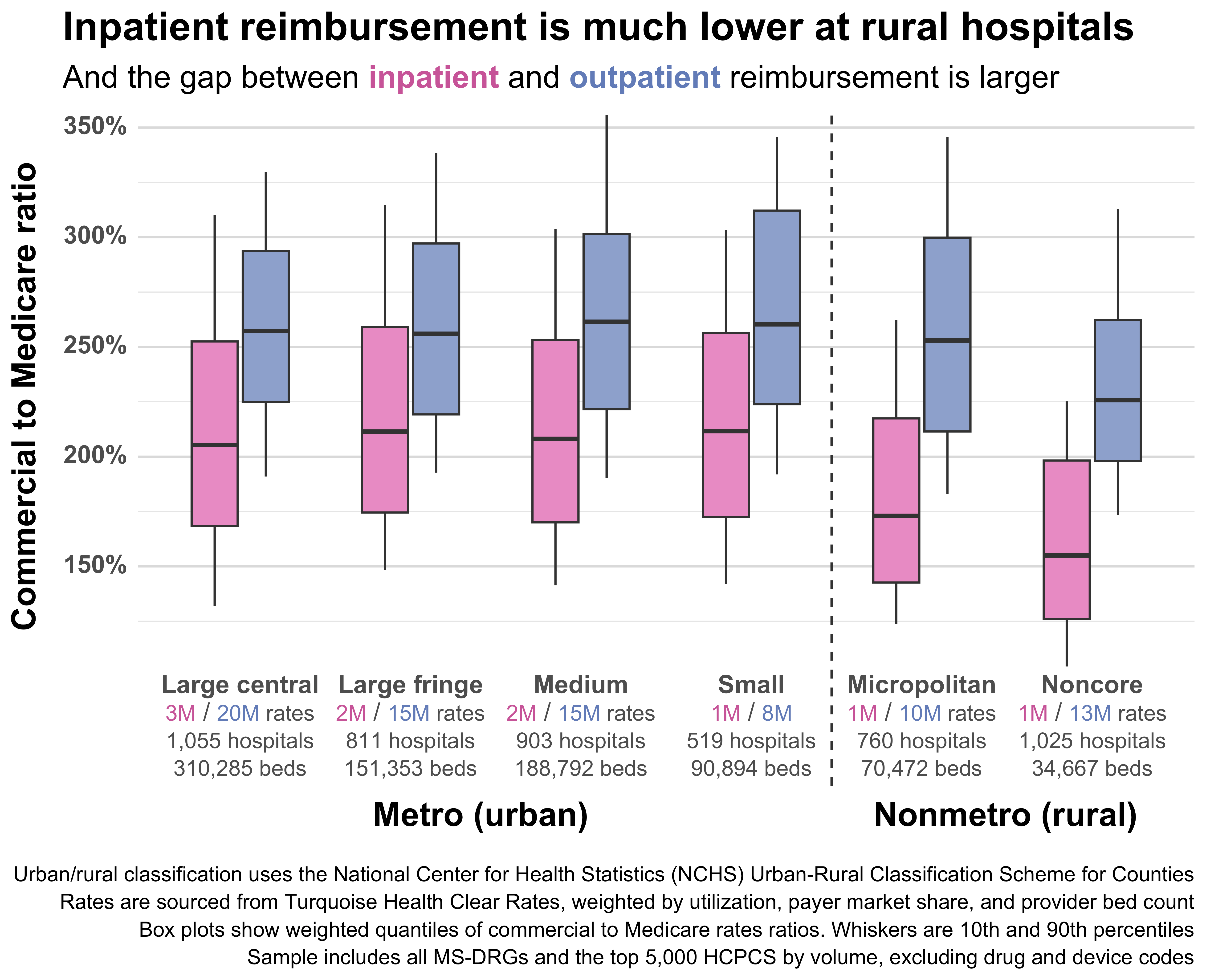
Low rural inpatient reimbursement could help explain why rural hospitals are increasingly choosing to cut inpatient service lines like obstetrics or convert to outpatient-only Rural Emergency Hospitals (REHs).
Health system affiliation is another interesting cut. Independent hospitals tend to be reimbursed at lower rates than hospitals affiliated with a health system, and rural hospitals are more likely to be independent. In practice, that means that aggregated rural reimbursement is dragged down by the high proportion of independent hospitals in rural areas, even though the gap between independent and health system-affiliated hospitals is larger in urban areas.
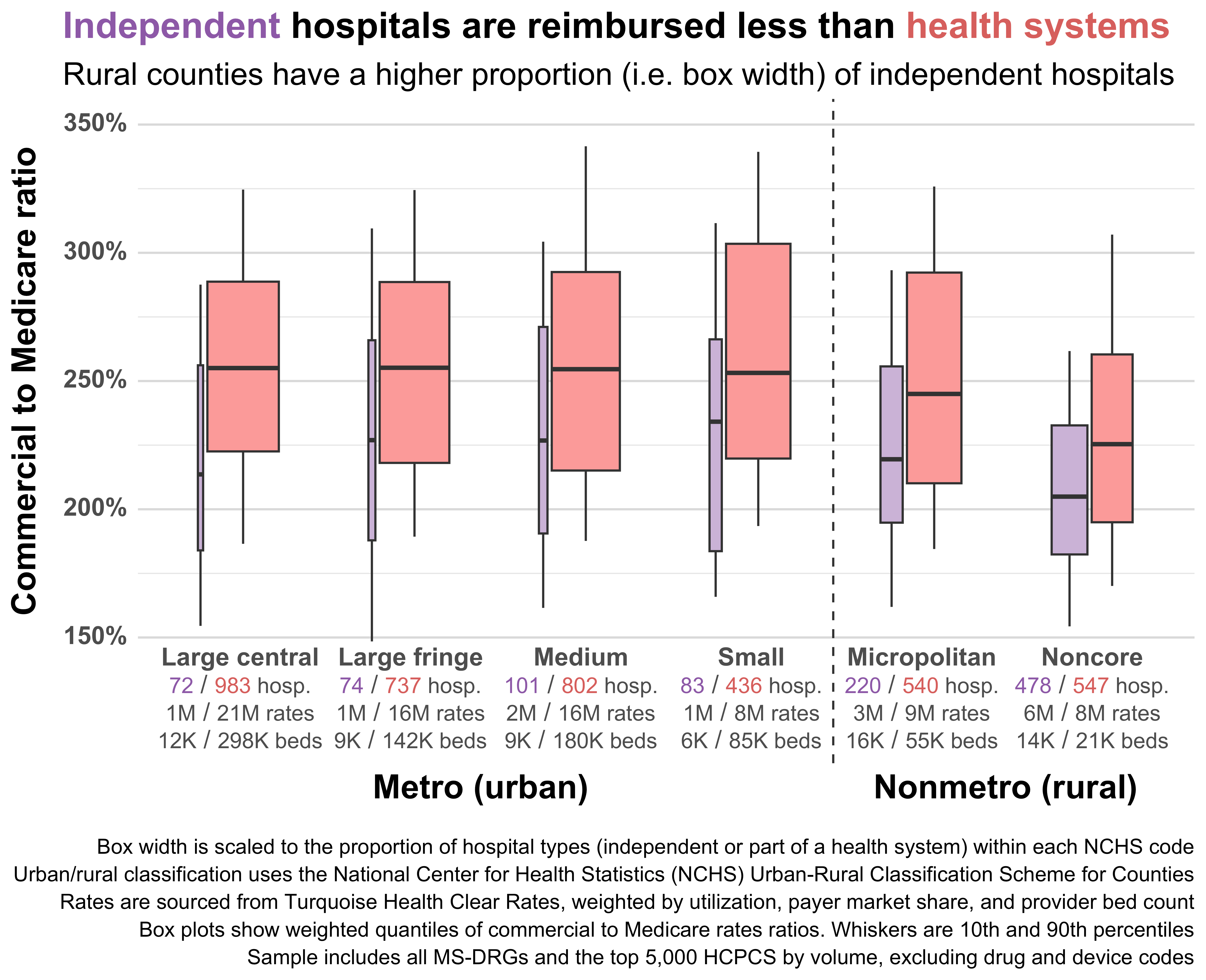
The lower reimbursement of independent rural hospitals mostly stems from their reduced market power. Such hospitals just don’t seem to have much negotiating leverage with commercial payers, even if they’re the only hospital in a given county or area. Clinically integrated networks are one way independent rural hospitals are starting to push back and regain negotiating power.
Reimbursement also varies by hospital ownership structure. Government-owned hospitals tend to be reimbursed less by private insurers, and rural hospitals are more likely to be government-owned and less likely to be for-profit. Here’s hospital ownership by rurality; note that the most rural (i.e. noncore) hospitals are excluded since they’re almost entirely missing ownership data:
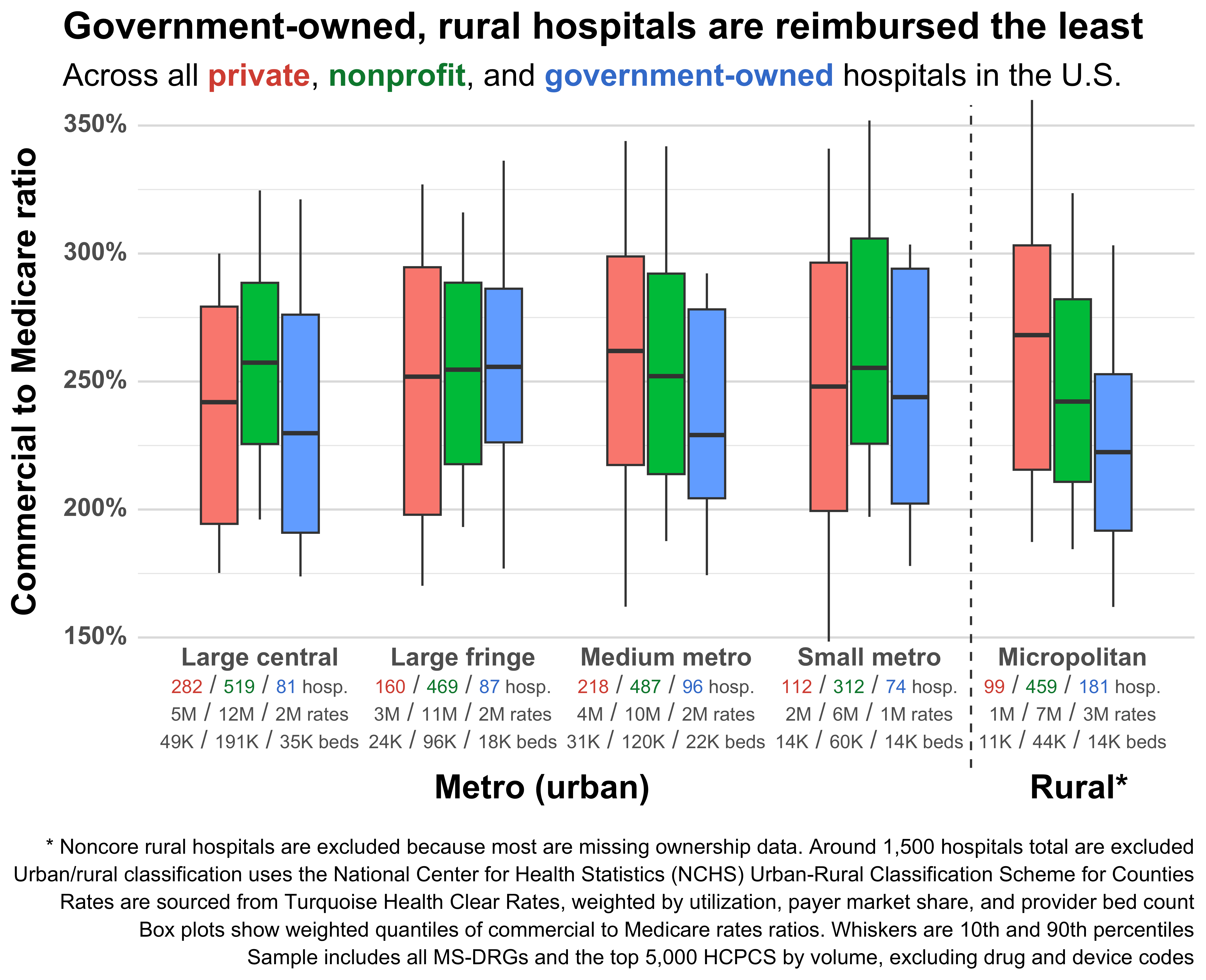
Government-owned rural hospitals have the lowest median reimbursement of any group, while private rural hospitals have the highest. Curiously, the most urban government-owned hospitals also have very low reimbursement.
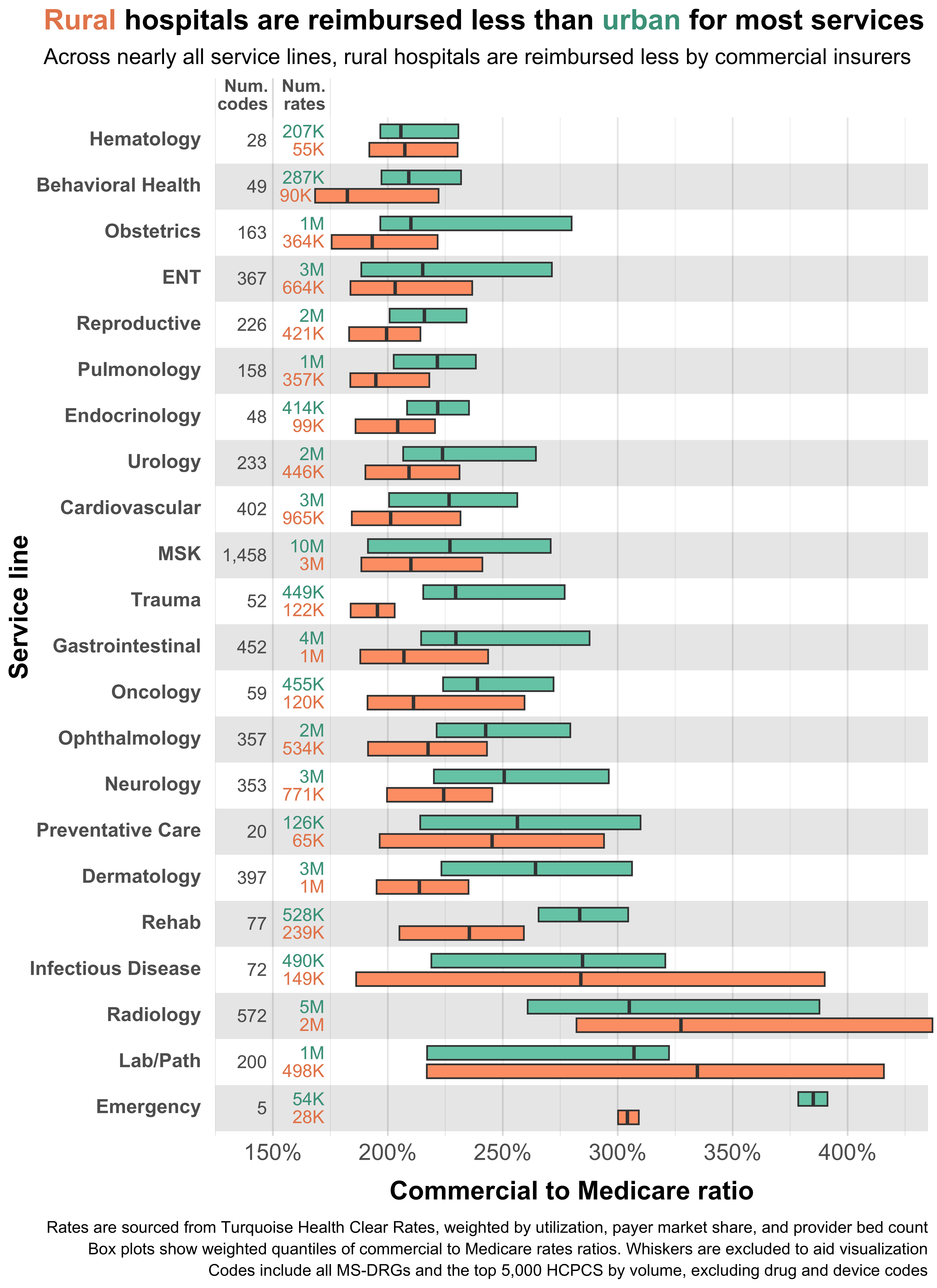
We can also break out urban and rural hospitals by service line. Here the familiar trend repeats; urban reimbursement is generally higher than rural reimbursement. However, there are some interesting exceptions. Lab work and radiology both receive higher reimbursement at rural hospitals. I’m not entirely certain what to make of this. It could be the result of rural hospitals attempting to cross-subsidize costly care using high volume, well-reimbursed care. Or it could simply be denominator-driven, i.e. Medicare reimbursing those service lines at slightly lower relative rates in rural areas (thus making their commercial-to-Medicare ratios higher).
There are a lot of other ways to slice this data, but most of them don’t make for very interesting plots. Here are some of the other variables I looked at and how they compared across urban and rural hospitals:
Payer mix - Rural hospitals treat more patients on Medicare than urban hospitals. Since Medicare reimbursement is (usually) lower than commercial reimbursement, rural hospitals may cross-subsidize care by hiking commercial rates. I looked for evidence of this trend, or any relationship between payer mix, rurality, and commercial prices, but didn’t find anything compelling.
Patient volume - Rural hospitals typically have lower patient volume due to the low population density of rural areas. I hypothesized that low patient volume might require higher commercial rates to offset the high fixed costs associated with each patient, but if anything, the opposite seems to be true. Larger, higher-volume, non-government rural hospitals had significantly higher reimbursement than small, low-volume rural hospitals.
Procedure volume - This is a tricky one. My theory here is that rural hospitals may negotiate higher rates for their highest volume procedures and take low rates on everything else. This would muddle the aggregations in the plots above, since those use state-level rather than provider-level utilization weighting, and individual providers might have very different utilization profiles. Unfortunately, utilization data at the provider-level comes from claims, which are incomplete, lagged, and sparse for rural hospitals.
Quality - Most studies find little correlation between hospital quality and prices. To confirm this, I compared reimbursement rates across CMS star ratings and levels of rurality. I similarly found no relationship between quality, rurality, and commercial reimbursement.
Market concentration (provider) - Quantifying market concentration for rural hospitals is complex. The Herfindahl-Hirschman Index (HHI), the most commonly-used measure of hospital market concentration, is typically calculated using CBSAs or MSAs as proxies for competitive markets. However, rural hospitals are typically outside such geographies and thus need to be grouped into custom markets or peer groups.
Further, any analysis of market concentration in rural areas has to disentangle two competing price effects. Small, independent rural hospitals start with almost no negotiating power (no health system, low patient volume, etc.), so payers will give them low reimbursement. However, such hospitals may have exclusive control over a region, increasing their negotiating power with payers who want to build a complete network.Quantifying rural market concentration and price effects would be a massive undertaking and is beyond the scope of this study. Health system-affiliation (used in the plot above) is the closest we’ll get for now.
Market concentration (payer) - States or regions that are dominated by a single insurer tend to have lower reimbursement rates. I used state-level payer market share to construct an HHI, then compared rates across high- and low-market-concentration states. I found that while high-market-concentration states do have lower rates, there’s no clear relationship between rurality, payer market share, and prices. In other words, prices move in tandem across urban and rural hospitals as payer market share changes.
Program status (CAH, REH, RRC, LVH, etc.) - Federal and state governments run dozens of special payment designations and programs to support rural hospitals. Many of these change the way rural hospitals are reimbursed (e.g. CAH and REH). I didn’t find any relationship between special payment designations and commercial rates. See the Methods section for further complications related to Medicare rates.
There are probably dozens of other variables that drive the urban-rural reimbursement gap. If you have suggestions for others I should look at, feel free to drop a comment or email me.
Closing the gap
Rural hospitals are systematically reimbursed less than their urban counterparts by commercial insurers, with the gap reaching 20 percentage points nationally and widening to 33 percentage points for the most rural counties. While there’s significant variation in urban/rural prices and some rural hospitals certainly receive higher rates than equivalent urban ones, the overall national trend is unambiguous – rural hospitals simply receive less on average.
The granularity of this new dataset, spanning over 5,000 hospitals and 93 million rates, also exposes other previously invisible patterns: rural inpatient reimbursement drops sharply compared to outpatient reimbursement, independent rural hospitals lack the negotiating leverage of their health system-affiliated peers, and government-owned rural hospitals are reimbursed much lower than private and nonprofit facilities.
For policymakers focused primarily on Medicare and Medicaid, these findings should serve as a wake-up call about the commercial side of the ledger. Small shifts in commercial reimbursement can mean the difference between operating in the black or red for rural hospitals already operating on thin margins. To stabilize commercial reimbursement, states should consider using money from the recently announced Rural Health Transformation Program (RHTP) to help rural hospitals improve the technical parts of their revenue cycle (e.g. increasing automation, getting better data for commercial negotiations, and integrating with revenue recovery software). States could also use RHTP funds to help rural hospitals form Clinically Integrated Networks, groups that allow them to pool resources and collectively negotiate rates.
Without addressing the commercial reimbursement gap, we risk accelerating the closure of rural hospitals, the elimination of essential service lines like obstetrics, and the continued consolidation of rural providers into larger health systems – all of which will ultimately lead to worse health and economic outcomes for rural areas.
Methods
This sort of price analysis can be sensitive to the assumptions and methods used during cleaning, classification, and aggregation. To ensure that the results are robust to such choices, I re-ran the analysis with a few major changes. In other words, I did a sensitivity analysis of the most important variables and assumptions. The checks here are not exhaustive, see the GitHub repository for the public code and a full methods breakdown.
Weighting and sampling
This analysis uses weighting to aggregate individual negotiated rates at the payer-provider-code level all the way up to the county level. Weights are applied to three different aggregations:
Starting from the payer-provider-code level, rates are aggregated to the payer-provider level by taking the mean, weighted by each procedure code’s state-level utilization (sourced from claims volume).
From the payer-provider level, rates are aggregated to the provider level by again taking the mean, this time weighted by each payer’s state-level market share (sourced from Policy Reporter).
Finally, provider-level means are aggregated to the county-level by taking the median, weighted by each provider’s total bed count (as a proxy for hospital size/throughput).
The goal of all this weighting is to downweight codes, providers, and payers that aren’t actually used very much and get the final aggregated commercial-to-Medicare ratio for each county closer to what insurers actually pay. However, this amount of weighting adds a lot of complexity and makes the results slightly suspect. As such, I re-ran the aggregation without any weights by substituting the unweighted mean or median in the steps above.
The results were somewhat surprising. The gap between urban and rural hospital reimbursement grows even larger using unweighted rates. Further, the entire distribution of commercial-to-Medicare ratios shifts downward i.e. things get cheaper relative to Medicare. You can see these effects in the middle boxes below, while the left-most boxes show the original, weighted distributions:
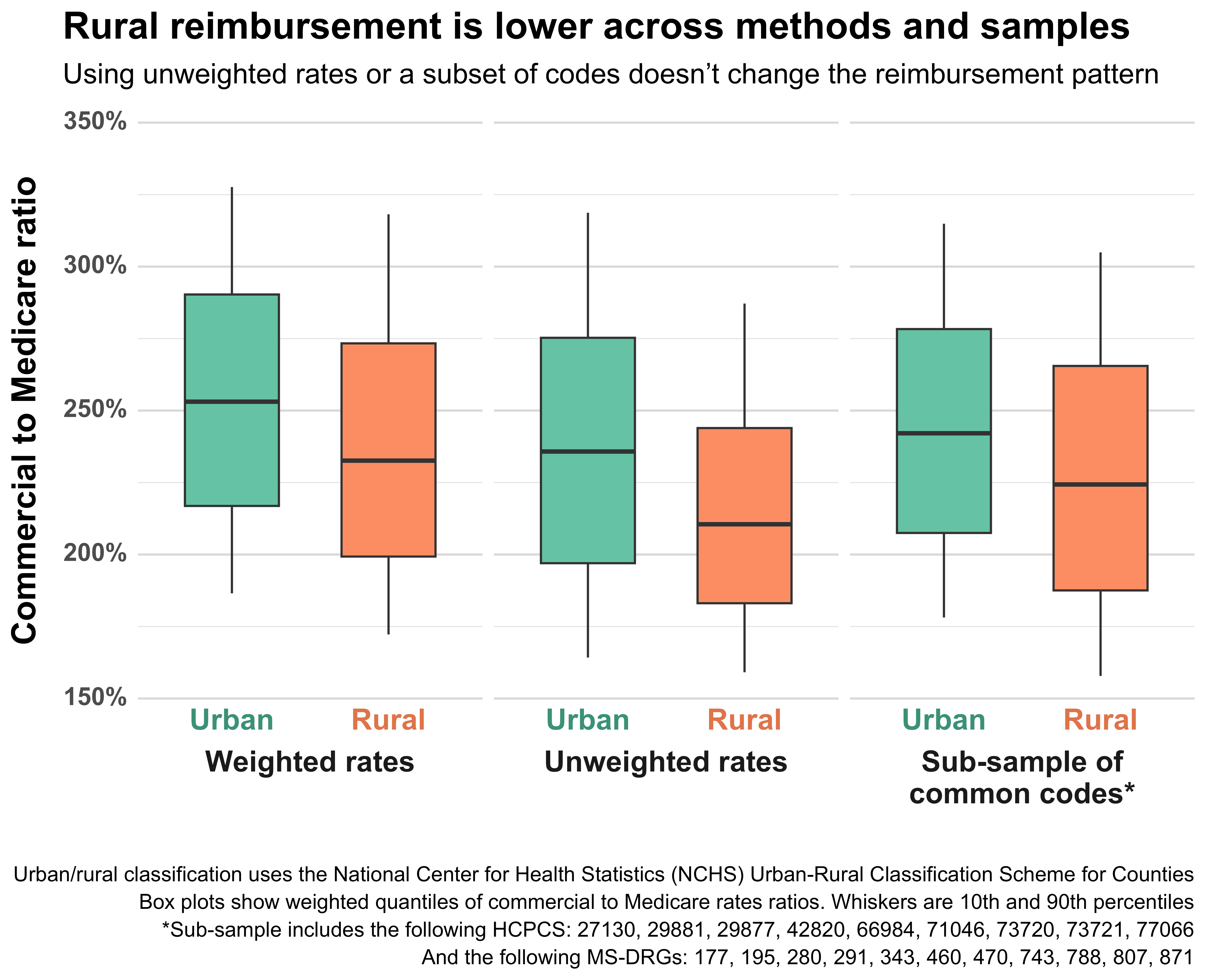
I suspect that this result is due to the composition of rates. Outpatient codes (HCPCSs, technically CPTs) tend to have higher utilization and higher reimbursement than inpatient codes (MS-DRGs). As such, weighting by code utilization will move the mean toward higher-priced HCPCS, raising the overall commercial-to-Medicare ratio.
To test this effect, and to make sure that my results weren’t otherwise dependent on the mix of codes, I also ran the aggregations using a sub-sample of common procedures. The results for the sub-sample are shown in the right-most boxes above. They are slightly higher than the unweighted results, but still below the weighted ones. The gap between urban and rural providers is roughly the same. This aligns with my expectations given the sub-sample’s mix of codes, as it contains a higher proportion of inpatient rates than the main sample (and would therefore be slightly lower).
Overall, the results do not seem sensitive to the weighting or composition of the sample – a significant urban-rural reimbursement gap persists basically regardless of how one aggregates or (reasonably) subsets the data.
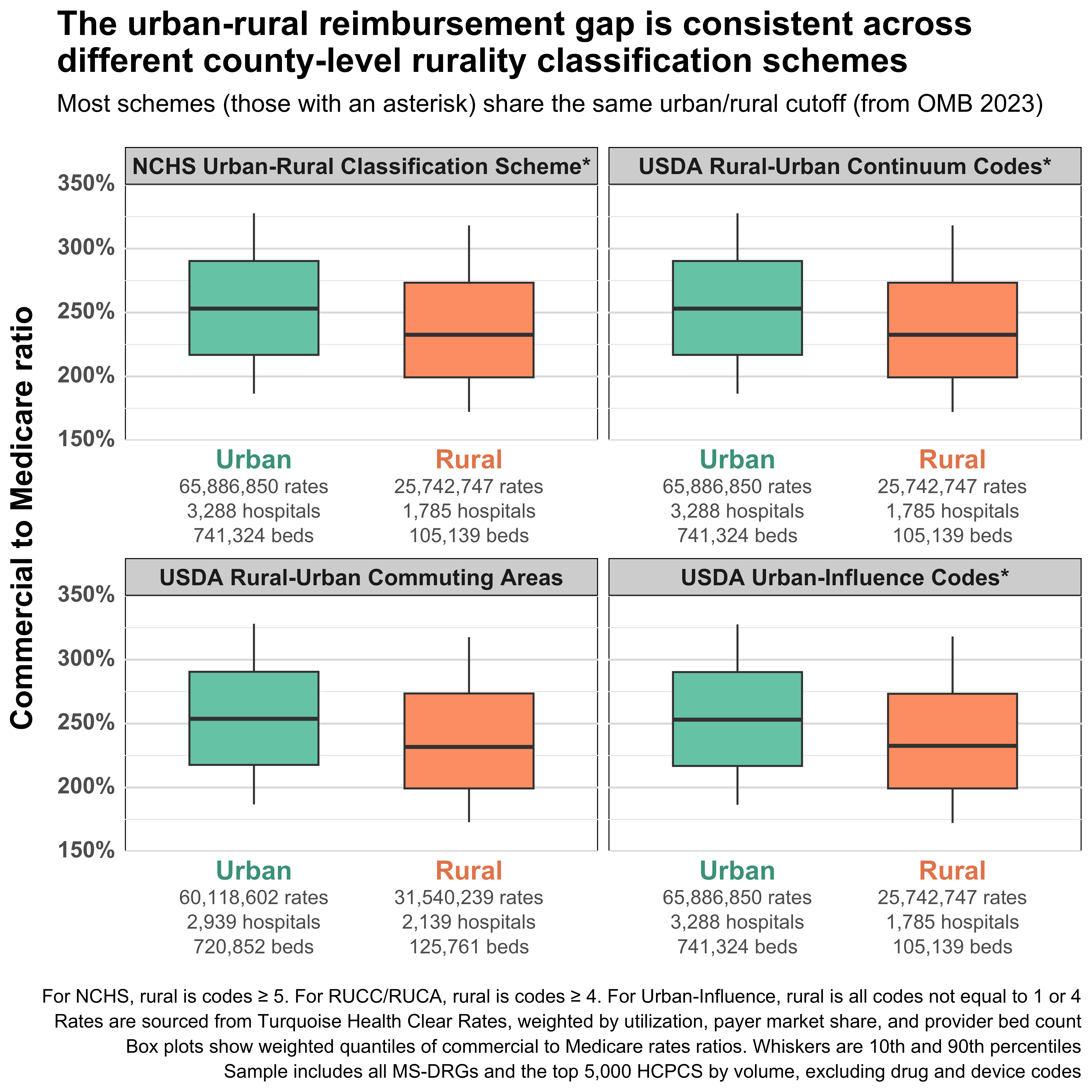
Rural classification
The analysis relies on a pre-made, county-level rurality classification system created by the National Center for Health Statistics. This system is based on the 2023 Office of Management and Budget (OMB) delineation of metropolitan (urban) and nonmetropolitan (rural) counties.
Given the centrality of urban-rural geographic classification to the analysis, I wanted to make sure that the results were not sensitive to the choice of rurality classification system. To test this, I re-ran the analysis using the urban-rural definitions from other classification systems, including Rural-Urban Continuum Codes (RUCCs), Rural-Urban Commuting Area Codes (RUCAs), and Urban-Influence Codes (UICs). To my surprise, RUCCs, UICs, and the NCHS system all shared an identical urban-rural split, despite differences in their underlying codes. It seems that the vast majority of urban-rural cutoffs used by the federal government are derived from OMB’s metro/nonmetro definitions. This is also true of CMS (ignoring dual classification) and HRSA, which use OMB’s definitions to geographically classify hospitals.
RUCAs do not share the same split as the other systems since they’re based not on counties, but on ZIP codes/Census tracts. Nevertheless, they have an urban-rural reimbursement gap that’s basically identical to the other code systems.
Though the classification systems share the same OMB-based urban-rural split, they look very different when broken out to their underlying codes. To check that the general trend visible in the NCHS codes is also present in the other code sets, I plotted all the code sets together:
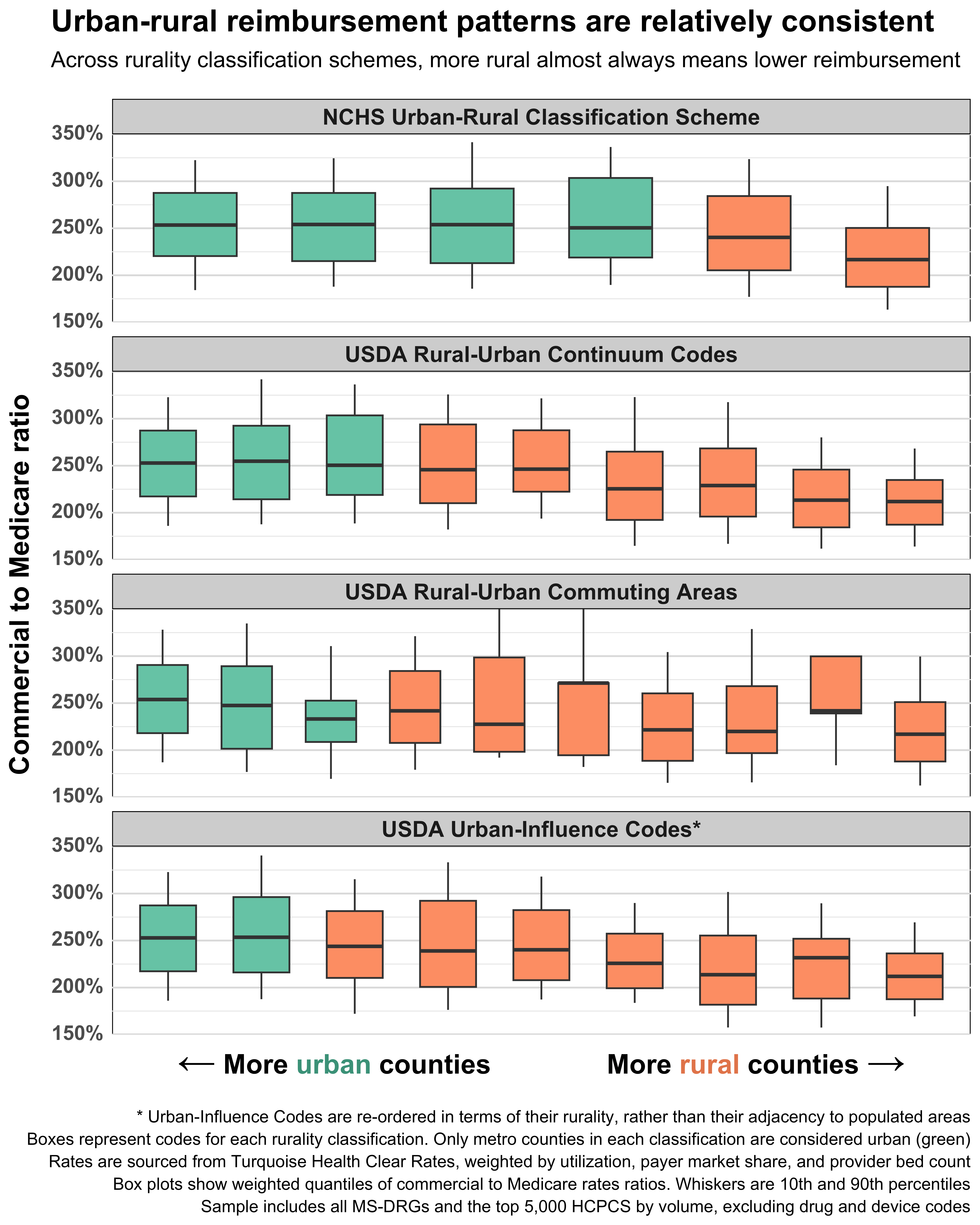
Some errant boxes aside, the trend here is unmistakable. Median commercial-to-Medicare ratios start high on the left (urban) side of the plot, then fall as you move right, toward the more rural classifications. The additional levels of rurality (compared to the two in the NCHS system) show that this drop in reimbursement is gradual and nearly monotonic – more rurality almost equals less reimbursement. Indeed, the most rural classification in each system always has the lowest reimbursement rates. The strength and clarity of this trend makes it very unlikely that the results are sensitive to the chosen classification system.
Medicare rates
In this analysis, Medicare rates are used as the denominator of our variable of interest: commercial-to-Medicare ratios. As such, it’s important that these rates are calculated correctly and don’t contain any systematic bias or errors that would confound our results. The Medicare rates in this analysis are calculated by Turquoise Health using IPPS/OPPS rules. Nearly all rates are provider-adjusted (i.e. they include adjustments for geography, DSH, etc.).
To check for systemic issues, I compared Medicare rates across urban and rural counties. I was specifically looking for Medicare rates that were erroneously high in rural areas, as these would lower commercial-to-Medicare ratios and (falsely) create the result we found.
Like the commercial-to-Medicare ratios, the Medicare rates also have a clear trend: rates decrease monotonically as you move from urban to rural counties. This intuitively makes sense, as CMS adjusts Medicare reimbursement to account for local average wages, and urban areas are more expensive/have higher wages than rural areas. But there are also other, more subtle things that would create this trend. For example, urban hospitals might have a procedure mix that would increase their reimbursement because they offer more complex, higher-priced care.
Ultimately, I found it difficult to disaggregate which parts of the Medicare rate trend were real (caused by expected sources like wages, DSH adjustments, and procedure mix) vs fake (caused by some kind of systemic error). None of the statistical tests or aggregations I performed indicated an obvious issue, but the rates are so inherently complex that I can’t rule out all potential problems.
One more wrinkle with Medicare rates is the previously mentioned special payment designations. These designations can increase Medicare reimbursement or even replace fee-for-service reimbursement entirely. For example, Critical Access Hospitals (CAHs) forgo IPPS/OPPS and are reimbursed at-cost.
Given the number and complexity of these special payment programs, they are not accounted for in the Turquoise-calculated Medicare rates. Instead, CAHs and other hospitals receive the counterfactual rates that they would have received under IPPS/OPPS. This is defensible as using counterfactual rates actually decreases the magnitude/size of the urban-rural reimbursement gap. Conversely, as Medicare reimbursement goes up under special payment programs, the commercial-to-Medicare ratio falls, widening the gap. In other words, the urban-rural reimbursement gap would probably be even larger if CAH and other special rural programs were accounted for.
For more information on methods and to view the public code used to make this article, see the associated GitHub repository.
Thank you for this excellent analysis. We’ve found similar disparities in our analyses of hospital cost report data, as described here: https://ruralhospitals.chqpr.org/Problems.html#private_pay_losses
However, our analyses show that the key factor is not how rural the location is, but how small the hospital is. The best measure of hospital size is its total expenses, not the number of beds (since most hospital care is outpatient not inpatient). Small rural hospitals (those below the median total expenses for rural hospitals, which is about $45 million) are paid much less relative to their costs by private payers (which includes Medicare Advantage plans) than by Medicare. The smallest rural hospitals (those under $20-25 million in annual expenses) are paid the least. It doesn’t matter that the hospital is the only hospital for miles around because network adequacy rules do not require a health plan to contract with the only hospital in a small rural community.
The differences between small rural hospitals and larger hospitals (both rural and urban) are described here: https://ruralhospitals.chqpr.org/downloads/Two_Types_of_Hospitals_in_US.pdf. You can find information on the sizes of both urban and rural hospitals here: https://ruralhospitals.chqpr.org/Data0.html and you can see the disparity in profit margins for Medicare vs. Private/Other payers by hospital here: https://ruralhospitals.chqpr.org/Data3.html
Your caveat about not using the actual Medicare payment amounts at Critical Access Hospitals is very important and it may not be understood or appreciated by many readers. The CAH program was created in 1997 because standard Medicare rates were not sufficient to cover the cost of care at small rural hospitals, and many of those hospitals were closing as a result. So Medicare pays CAHs significantly more than other hospitals for many key services, such as emergency department visits and inpatient care, because the cost per patient for those services is much higher in a small rural community. If a commercial insurance plan is paying the CAH less than the standard Medicare rates paid to larger hospitals, then it is paying the CAH a lot less than the actual amount Medicare is paying the CAH, so the actual percentage of Medicare will be much lower than shown in your charts. Medicare Advantage plans are not required to pay a CAH the same amount that Original Medicare does, and they often pay less, so the growth in Medicare Advantage plans nationally has been one of the reasons more and more rural hospitals are losing money. It sounds as though you also didn’t make adjustments for the higher payments received by Sole Community Hospitals, Medicare Dependent Hospitals, and Low Volume Hospitals, which is how many small rural hospitals that are not Critical Access Hospitals are paid, and if so, the actual rural/urban disparity is also greater as a result.
Lower payment amounts from commercial insurance plans are only part of the reason that small rural hospitals lose more money on those patients – the other reason is the excessive use of prior authorization and high rates of claims denials. Even if a commercial insurance plan or Medicare Advantage plan contracts to pay the hospital the same amount as Medicare would pay, they often don’t pay at all, so the actual net revenue the hospital receives is lower than the payment amounts would suggest. For example, if a health plan says it will only pay for a hospitalized patient as an observation stay rather than an inpatient stay, the hospital’s payment is much less than it would have been paid by Medicare as an inpatient stay, even if the health plan paid the same amount for an observation stay as Medicare would have paid. And if the health plan simply rejects the claim and the small rural hospital doesn't resubmit it in time, the hospital won't be paid at all. Small rural hospitals don't have the resources that larger hospitals do to appeal and resubmit claims denials, so their net revenues are lower as a result.
Thank you again for this excellent work!! I appreciate all of the time and effort that were required to do this.
Harold Miller
President & CEO
Center for Healthcare Quality and Payment Reform
[email protected]