

How much does it cost to give birth in the U.S.?
A lot, depending on where you live

TL;DR: This is the kickoff post for Price Points, a new research effort from Turquoise Health that uses hospital price transparency data, TiC negotiated rates, and other healthcare data to look at system-wide trends in U.S. healthcare pricing. To learn more about Price Points (who’s behind it, where I get the data, how to reproduce our analyses, etc.) read the introduction post or visit the About page. You can see the code, data, and methods for this post on GitHub.
The price of childbirth varies significantly by geography, complexity of care, insurer, and lots of other factors. It can be as little as $5K (for an uncomplicated vaginal delivery in rural Tennessee) or as much as $70K (for a C-section with major complications in the Hamptons). Nationwide, the average uncomplicated vaginal delivery costs right around $10K, which makes the U.S. one of the most expensive places in the world to give birth.
However, most patients won’t actually pay that much. These are negotiated rates; they’re what insurers pay out to hospitals, not what patients typically pay out of pocket. Depending on your deductible, co-insurance, and out-of-pocket max, you’ll likely pay a fraction of that $10K, maybe even nothing.
So why look at these prices if they aren’t what patients actually pay? Because the prices are paid by insurers, and patterns within them can tell you a lot about a hospital or insurer’s financials, market power, and strategy. Negotiated rates also let you compare across geographies and procedures without the complexity or lag of claims data. You get a real-time, nationwide picture of the true cost of care, even if not all of that cost is experienced by patients.
So, what does this nationwide picture look like for childbirth? Here's the state-by-state breakdown of negotiated commercial rates for an uncomplicated vaginal delivery (MS-DRG 807). Note that these prices only cover the hospital/facility fee, there may be additional costs for consultations, an epidural, etc.:
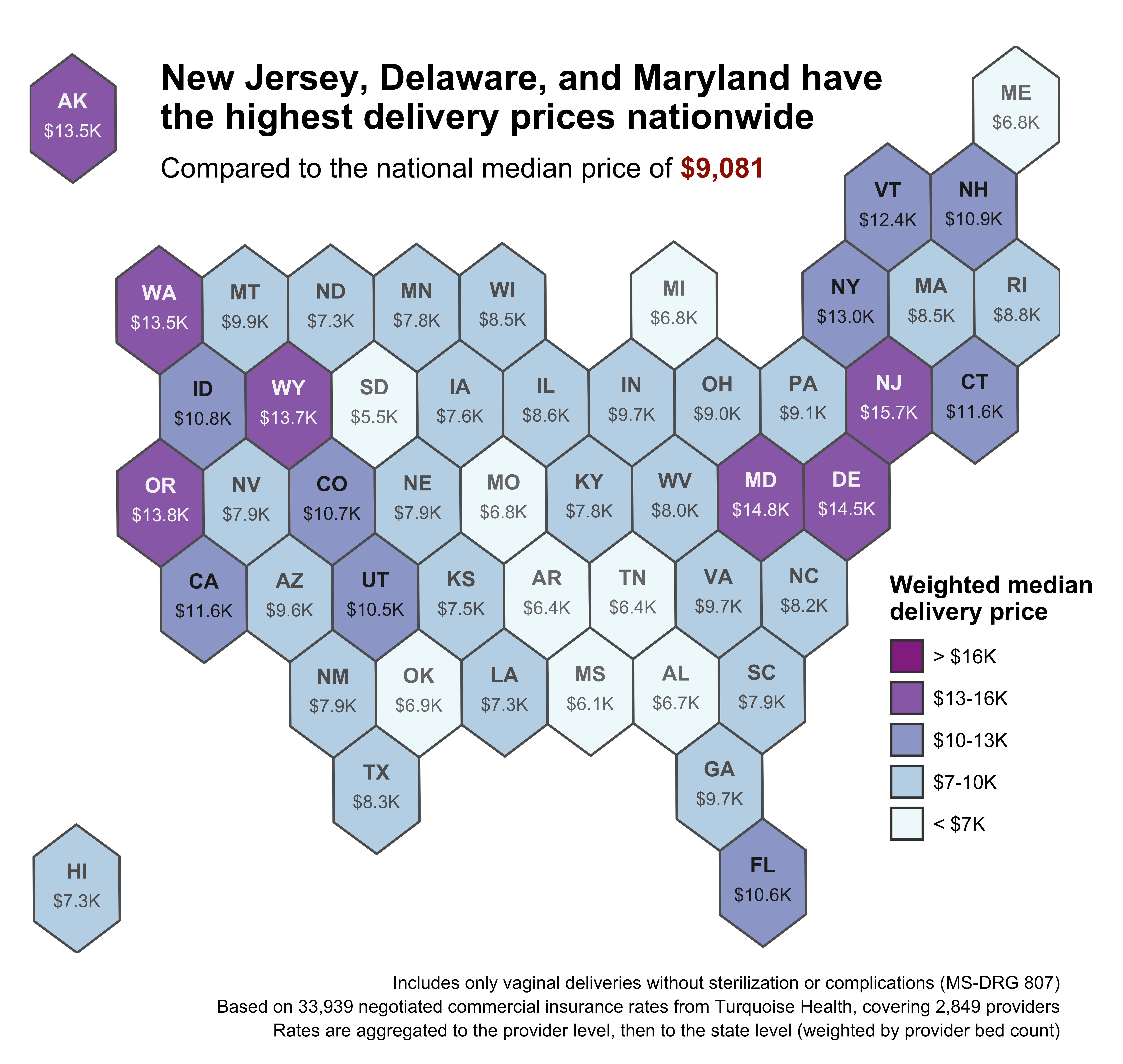
Broadly speaking, delivery prices are closely correlated with cost of living. Expensive states in the Northeast and Pacific Northwest have the highest prices, while states in the South have the lowest. Alaska is a major outlier, with high prices that likely stem from its low labor supply, low population density, and limited market competition. Similarly, Florida is dealing with a nurse shortage, limited competition, and an aging (i.e. more expensive) population. Hawaii is an outlier in the opposite direction; it has low delivery prices relative to its high cost of living.
But a map like this doesn’t actually reflect the way patients shop. Some states are huge; people aren’t going to drive from Houston to El Paso to deliver their baby. And people on the edge of a state don’t just stop at the border. Let’s try a smaller geography.
Here’s the same underlying data as the state-level map, but now at the ZIP code level. Each ZIP price is the weighted median of all providers within a 3-hour drive, regardless of state boundaries. Larger and closer hospitals get more weight, while smaller and distant hospitals are basically ignored.

Now we can see submarkets and trends within states: the rural northeast part of Maine is dominated by a single (expensive) healthcare system, while Portland and Bangor enjoy significantly lower delivery prices; New York City has some of the most expensive ZIP codes in the country, but most of New York state is close to the national median; and in California, the Bay Area and Central Valley top the charts for delivery cost, while southern California fares much better.
Some rural areas stand out as well: northeast Nevada, southwest Texas, and Nebraska all have clusters of high-priced ZIP codes. Some of those clusters are just noise - the result of errors in the MRFs of small, understaffed hospitals - but some of them are real. At least a few of the clusters stem from large providers cross-subsidizing their Medicaid patients via sky-high commercial rates. Others, like those in Nevada and Alaska, demonstrate how rurality and small patient populations can drive up the cost of care.
Other patterns in the map are hidden and only become apparent when you plot them. For example, here’s delivery price broken out by rurality:

Despite some high-priced rural outliers, prices in urban counties are nearly 50% higher than in rural counties and have a much wider range (whiskers represent the 10th and 90th percentile). Curiously, the 75th percentile price in central metro counties is actually lower than in fringe metro counties like Palm Beach County, FL, or Marin County, CA, perhaps due to higher cost of living in many exurbs.
We can get a closer look at individual markets by using CBSAs (core-based statistical areas), which are the healthcare industry’s preferred unit of analysis. Here are the top 20 largest CBSAs with at least 15 hospitals in the data:

Once again, New York and San Francisco lead the pack, with vaginal delivery prices ~60% higher than the national median. Conversely, low-cost-of-living cities in the Midwest are actually well below the national median (and don’t even show up on the ZIP code map). C-sections are shown on the right, and are generally about 50% more expensive than vaginal deliveries.
As you might expect, cost increases even further with complications and complexity. Here’s the national distribution of all delivery prices, broken out by severity and type of care:

Complications and comorbidities (CC/MCC) increase costs a lot, particularly for C-sections. They also increase variance. The standard deviation of prices for a vaginal delivery with no complication (MS-DRG 807) is ~$4.3K, while a complicated C-section (MS-DRG 786) is 3x higher at ~$13K.
All these plots paint a clear, if predictable, picture – higher acuity care costs more, and delivering a baby in San Francisco costs more than in rural Iowa. But this picture is incomplete. Prices vary significantly based on which insurer is paying, the market share of the hospital, and even the specific type of contract negotiated. How do narrow network plans affect these prices? How can hospitals in the same market have such vastly different prices? How is healthcare in Hawaii so surprisingly affordable?
Answering such questions - understanding the real nuance and complexity of the U.S. healthcare market - is crucial to achieving the transparency and efficiency CMS originally envisioned when mandating this data's release. In the coming months, Price Points will tackle these issues with open-source code, methods, and data. Subscribe to join me on the next deep dive exploring the complexities of healthcare pricing.